


The Elements of Design
Brief overview of the basic elements of design through the lens of Interior Design and Surface Pattern Design

Hello and happy Friday! I hope everyones week has gone well, I know with all the holidays in the US over the last month, and coming up into the New Year, life in general can be a chaotic time. So no matter where you are I hope everyone is doing as well as they can be, and better! I’ve been wanting to talk about this topic for a while, and for some reason I’ve really pushed myself into a hole until I realized I didn’t have to. I’m writing this to you at my dining table, here in Florida. The sun is shining and while its much greener here than in other places in the world, but it has this wintery glow about it that I’ve always enjoyed. Cooler than it has been in months and I find myself being carried away and wanting to walk in nature. This has also spurred me to want to talk about this process, because while it gives structure, nature has it’s own composition of the elements we’ll be talking about today. These elements of design are standard among all art and design. From art, to web pages, articles in a magazine, holiday or birthday cards, or wallpaper. Anything you can think of these elements can be present. It’s just how you apply it that’s different.
The basic elements of design are; Form (point, line, plane, volume, shape), Scale, Color ( hue, value, intensity aka chroma, tint, shade, color schemes etc.) Texture, Pattern and Light.
They can be broken down further below:
Form - the basic shape and configuration of an object or space
Point - two dimensionally perceived object appears relatively small in relation to the plan against it. Like a dot on a page
Line - an object or form whose actual or visual length greatly exceeds any actual width or depth it may have. OR when one plane meets another an an edge occurs.
Plane - a form with two dimensions, length and width
Volume - true three dimensional object and clearly perceives as having a spacial form of length, width and depth
Shape - unique characteristics of an object or space that defines it as a distinct from an object or shape. They are distinguished by planar or volumetric forms and can be geometric, irregular or organic.
Scale - relative size of something compared to related object of known size.
Color - The physical property of visible light. There is a lot more to color but below are some basics to it.
Hue - the basic color (like blue or red)
Value - the degree of light or darkness of a color in relation to white and black
Intensity aka Chroma - the degree of purity of the hie with compared to neutral gray of the same value
Tint - white is added and the to a hue the value is raised.
Shade - black is added to the hue and the value is lowered
Color schemes - five common methods of using color and are applicable regardless of the specific hues used. They are monochromatic, analogous, complementary, triad and tetrad
Texture - surface quality of a material. From either the inherent structure of the material of an application of a coating on it.
Pattern - repetition of a decorative motif on an object.
Light - How other objects in an environment are seen and affects how objects are perceived. Lighting is both an art and science and good lighting requires a combination of technical and aesthetic sensibilities.
Interior Design:
From an interior design stand point for example lines can be the walls and seen as horizontal and vertical lines or planes. Counter spaces, art, anything in a room can be broken down into lines, shapes, planes volumes, etc that show the negative and positive space of a room and how the volume of the space hold it all.
Scale is an important in a space because if you have a small apartment, having a large couch that takes up almost the whole room, would not only make the room feel even smaller, but also make it hard to have the right flow in the space for movement. Likewise having small pieces of furniture in a large room will make the room feel even larger, and create an uncomfortable effect whether people are aware of it or not.
For color this can be a pretty obvious and one I think clients will either A) think a lot about or B) not care as much with their designs. Through using things like basic color theory and the psychology of color, we as interior designers use color to can affect someone’s mood of a space in the way that they want. What colors my clients like, and how they affect their mood are an important part of how I would go about to a design a space. Also using colors that compliment each other in some way without using too many, anywhere from 3-6 colors are pretty standard (this can be in any scheme including monochromatic, though with that it may be hard to live in a space that’s all one color). Color can help give you that feel for a certain vibe, in a balanced way when used with other elements. Just having different colors in a room won’t always give you what you want.
With Texture, I think this is something clients think about, but in a way that might not be conscious. How things look and feel is important when creating a space. If something looks like it will be hard, and smooth and you want something to look soft and comfortable, you’re likely not going to want to go for that item. If something looks scratchy you may not want to sit on it. Comfort, and how you want things to look and feel is the aspect of texture. How you implement it in a space, and what you implement with can have varying affects. You may want a comfortable, cozy space but if everything in there looks soft and warm, it may be too much to look or feel too soft and maybe even hot. Where would you place things down? What hard surfaces can look warm and cozy but create different degrees of form and texture in a space? Balance is always a good thing to go for and many times people have this inherently whether they know it or not. You might not feel comfortable with blending colors together but noticing texture is something I think peoplecan do pretty well. There are two “types of texture” Visual, and actual. Actual is what you feel, and visual is how you percieve a texture of an object.
Pattern - like with surface pattern design, is the repetition of a decorative motif. Like on a pillow that can tie all the colors of a room together, a rug or a wall-covering. It’s close to texture, in that it needs to be used carefully, or else it will become too much and overpower a space. Pattern can help bring in movement, and like texture add little things to a space to make it not feel like one solid object.
Light - something I have talked about before, but it’s not just about sustainability here! Light can be how light or dark a room looks in general. You may want a room to look cozy like before, but maybe not dark like a cave, so how can you incorporate lighter fabrics and colors into a warm space to brighten it up? What actual lighting temperatures can you bring in? If you want that cozy space, do you want it to have a warm yellow glow, or does a white light seem ok? Do you want the light to be subdued to create more of that warmth with a lampshade next to your sofa? Or do you want a general down-light to light the space? Shadows, and light are both a technical and aesthetic way to create emphasis, or deemphasize and area that you don’t want people to really look at. Creating focal points in a space while also illuminating a space to give more or less depth. It can also add interest in the fabrics, and materials that you choose through enhancing the colors and spacial perception.. You can have all the light you want in a room, but if everything is dark it’s going to absorb it and you may find yourself in a cave 24/7 without knowing why.


Surface Pattern Design:
These elements are similar for surface pattern design too, but can vary due to the medium used. This will be a little more straight forward, but with that said:
Form - This is the depth of the pattern and how to distinguish the elements created in the pattern. Such as different plants or flowers, animals or other shapes are in the piece. This can also play into texture if you use points or lines in a way with color to create emphasis.
Scale - how large and small something is. In the case of surface patterns this is key to noticing when applying on objects. If you have a pattern on a wallpaper you’ll want it large enough not to get lost if you’re across the room and blend together. But likewise you’ll want it on a smaller scale if it’s on a pillow so you can see the repeat.
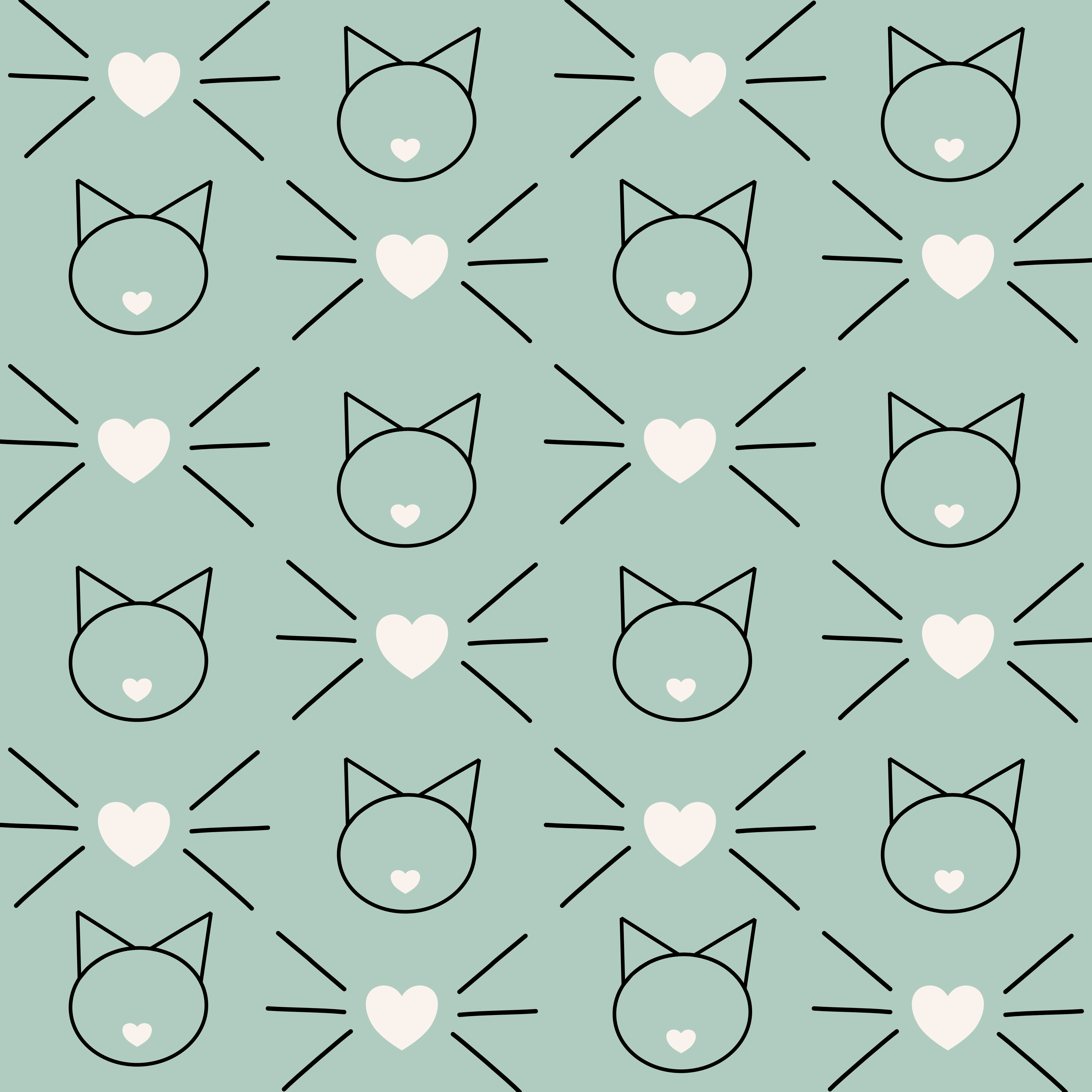
Color - Much like with interior design, finding colors that complement what you’re working on and using cohesion across multiple patterns if in a collection makes it easier for people to mix and use different pattern types (I.E. Hero - main larger pattern or filler - smaller patterns like the cat one below).
Texture - What elements in the pattern make them look different? Does the entire thing look smooth or are there smaller pieces in the background that make the texture seem different depending on what you’re looking at? Are things jagged in the pattern or organic?
Pattern - This is what surface pattern design is. How does it flow and what does it incorporate? How does it repeat and is the repeat noticeable or not?
Light - with patterns this is the light and darkness of a color, and if you have the same pattern with different color schemes, this can apply especially if one is lighter looking than the other. Creating different moods with the light and colors togehter. It can also enhance the pattern, and create emphasis on specific elements in the pattern through how light and dark those elements are.
Incorporating all of these elements make a cohesive design, and a good starting point for how a space or design can come together. Many times you can use all of these and not even consciously realize it, but knowing the foundation of what the elements are can also help you pin point what might be lacking in your piece or space.
When first creating a design for a space, understanding where the windows and doors are, the height, length and width of the space, so you can have a 3D of the space, whether in a physical drawing or a 3D model, then the elements can start taking shape after. When talking to a client I ask what their needs and wants for the specific space. This is where the elements start coming into play. While you’re space planning so you can create flow, and see where these elements can take shape (literally and metaphorically)
How have you incorporated any of these elements into your home in a way that you like? I invite you to share below and I’ll share one of mine too!